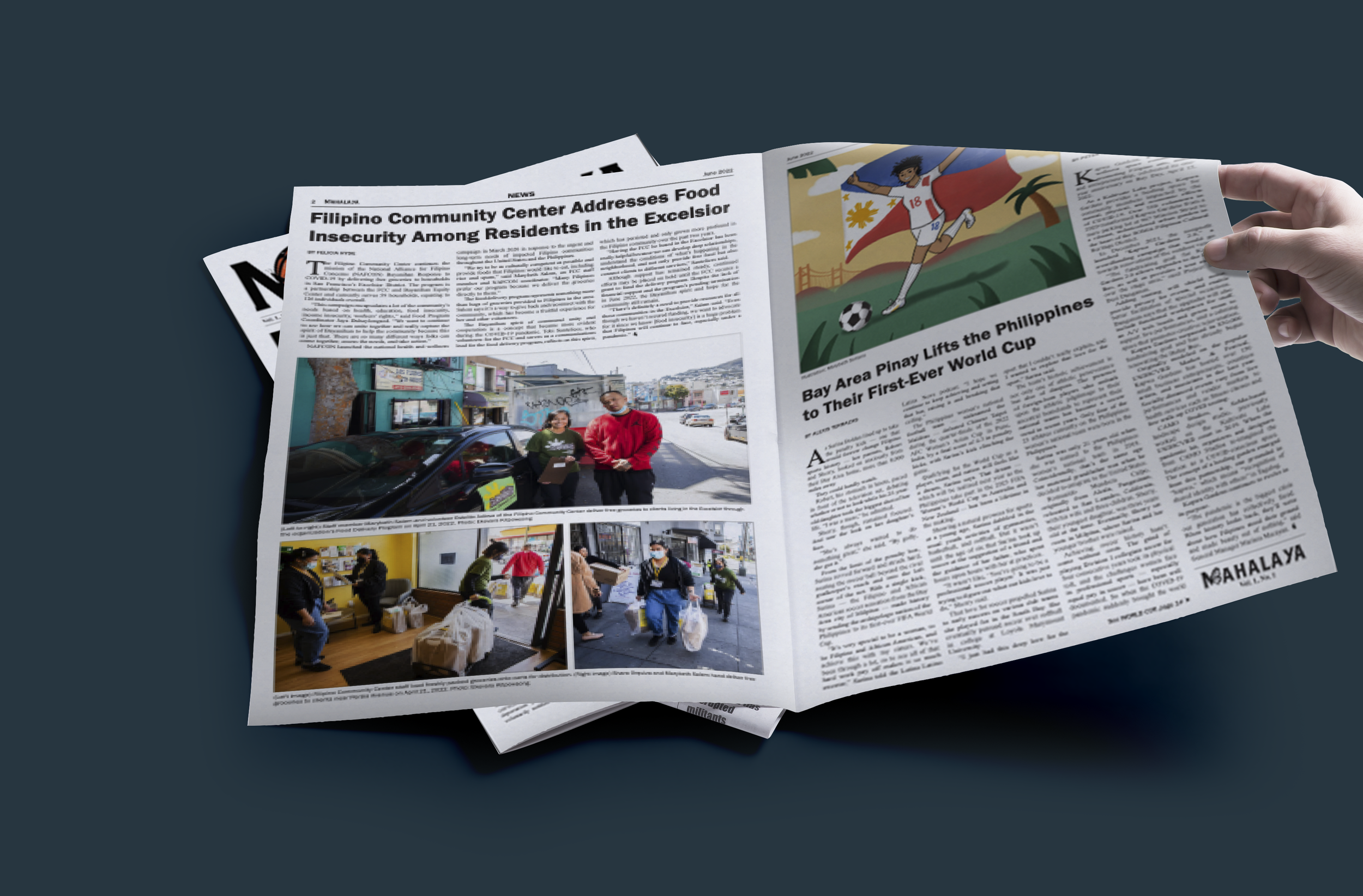
Mahalaya Community Newspaper Logo
Mahalaya is a community newspaper based in San Francisco, founded by Casey Ticsay in 2022.
Powered by a staff of dedicated volunteers, this publication centers Filipinx narratives and experiences in and beyond the Bay Area through solidarity journalism. Mahalaya has been distributed amongst The Mission District in San Francisco, Los Angeles, New York, and throughout Northern America.
Challenge
Design a brand-new graphic identity for the founding newspaper.
It must represent Mahalaya, two separate words in Tagalog put together to define “love and freedom” while being a symbol recognized as an encompassment of migration, solidarity, and storytelling.
Design Tools
Adobe Illustrator, Procreate on iPad
Final Logo
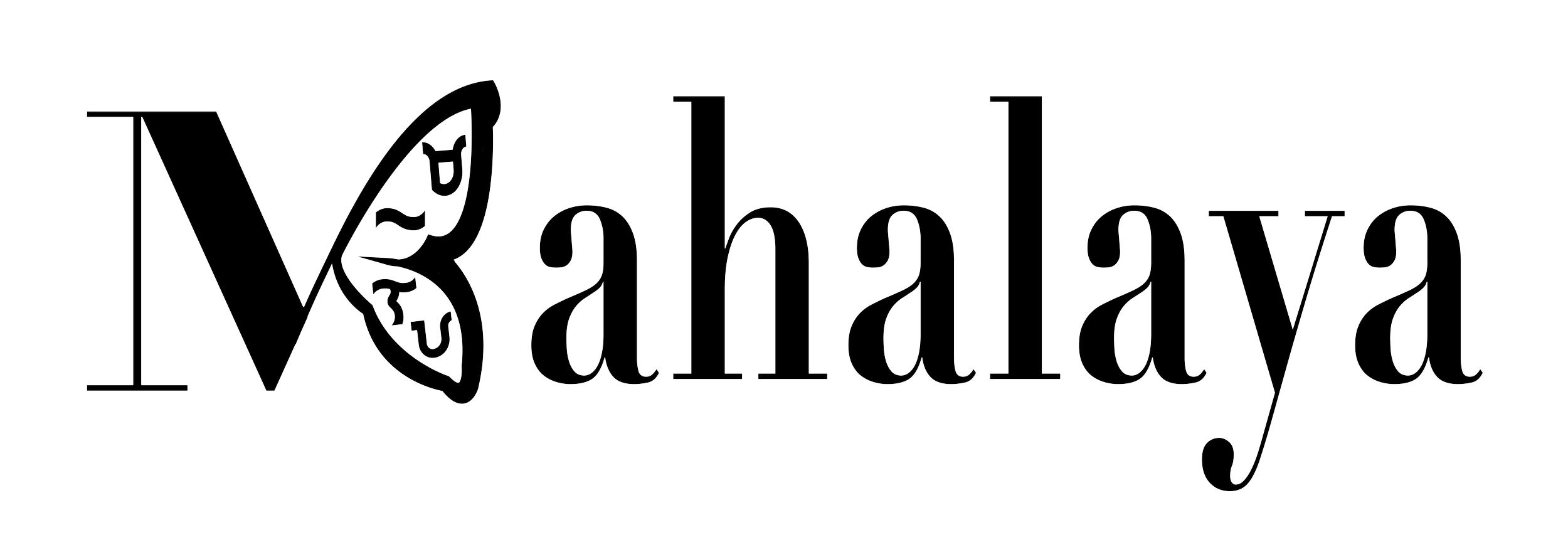
Because Mahalaya includes stories from the perspective of the Filipinx diasporic experience, I incorporated the monarch butterfly into the design. As a symbol of migration, the monarch butterfly completes the other half of the title letter M in the logo.
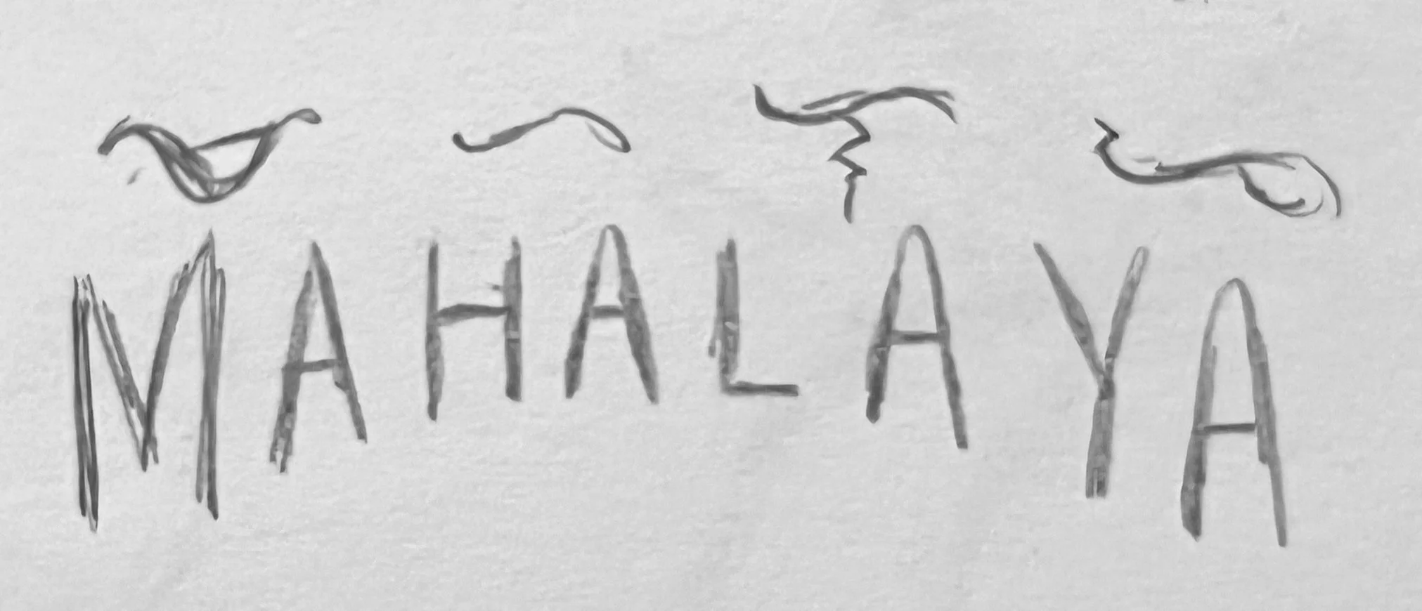
As a newspaper that acknowledges decolonization, the design in the wing of the monarch butterfly integrates Babayin script, the Filipinx pre-colonized alphabet, which spells out to say Mahalaya.
I created 2 versions of the logo that could be used depending on the context, the logo mark, and the full title.
Deliverables
Graphic Identity, Print Media, and Digital files
Team + Roles
The team consisted of 20 dedicated writers, poets, photographers, and illustrators. My responsibilities included logo development and branding, with feedback from
Editor-in-Chief, Casey Ticsay.
Logo Process
The process to create the logo was collaborative and iterative. We started off by listing other community journals and newspapers that inspired us and why. From there, we knew we wanted the logo to be a symbol of coming together and reunification for the Filipinx Diaspora, our target audience. I worked closely with the editor, sending her sketches and digital drafts. The next week, she would give feedback and her notes, while I would make those adjustments. Besides the editor, the logo was reviewed and given feedback from students and professors of the Migration Studies Department at the University of San Francisco, under which this newspaper was funded.
This was our weekly process for 1–2 months until the logo was finalized.
Research
The monarch butterfly is a universal symbol of migration.
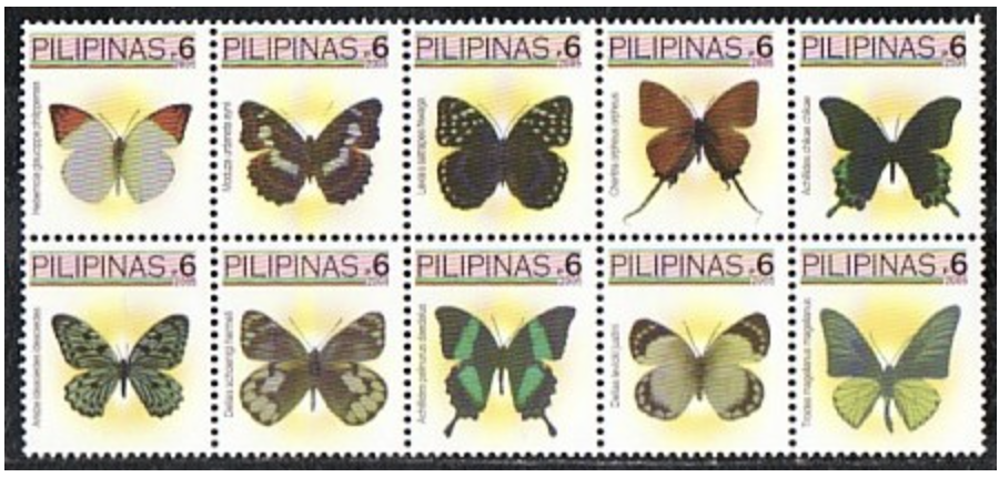
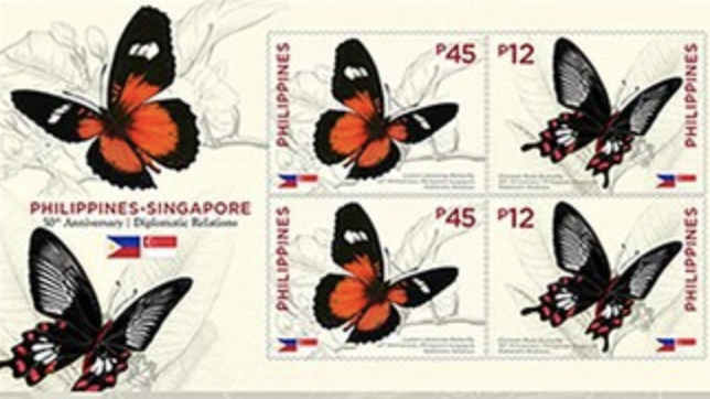
Because we wanted to incorporate the monarch into the logo, during the research phase we studied various butterfly species that are native to the Philippines. Additionally, I looked into several styles of Babayin, the Philippine script pre-colonization, and learned how to spell Mahalaya in Babayin.
We studied similar community journals and newspapers that inspired us and how their logos were impactful.
Takeaways
I carry this project very close to my heart because it has been very meaningful to be a part of it. The level of research it took to create the logo not only enabled me to look deeper into my Filipino roots, but gave me the knowledge to establish a culturally connected logo. It was fascinating to see the various options of logos, but very rewarding when we honed in on the final design.


